So before the film school nerds explode, let me just explain what a ‘scrim’ actually is and what the term colloquially means to us photographers.
Technically scrims are large sheets of black woven fabric that reduce the brightness of a light when placed in front of them (these are usually constant HMI lights that don’t have individual brightness adjusters).
There are alternative large sheets of fabric that are placed in front of lights called ‘silks’ and these are actually white in colour. When ‘silks’ are placed in front of the lights, they diffuse the light and spread it over a far wider area resulting in very soft lighting. You could consider that a softbox is actually just a small silk as it has a large sheet of diffusion material in front of the light that softens it as it passes through it.
So what’s the confusion between silks and scrims?
Like I said, colloquially we photographers tend to use the term ‘scrim’ when referring to large sheets of diffusion. Theatres actually use the same wording for similar semitransparent sheets of white fabric and it may be where the confusion comes from. But rightly or wrongly, if you ask for a scrim on a photoshoot, someone is gonna grab you a large sheet of diffusion.
But regardless of whether you call your huge sheets of light diffusing fabric scrims or silks, let’s get on with article.
What does a scrim actually do?
Like I said, think of these scrims as HUGE softboxes. You place your light on one side of them and when you shine that light through them, they essentially enlarge the relative size of the light source and as a result you get extremely soft light.
Take a look at my quick example below. The top row of images is a strobe with an open reflector dish attached. The bottom row has that same open reflector dish, only this time I’ve placed the white scrim (it’s actually the diffusion that sits inside those 5-in-1 reflectors) and you can see it in the shot on the bottom left. See how the shadows and contrast of light changes dramatically between the two setups? This is what placing a simple large sheet of diffusion material in front of your light can do to your image.
Click to enlarge: The top row of images above is with a bare strobe light. The bottom row of shots has that exact same bare strobe, but this time is has a scrim placed between the light and the subject. See how the shadows on the subject change dramatically with that one simple addition.
Why should I use a scrim?
This is personal preference of course, but many people like the extremely soft lighting effect a huge scrim provides. This type of lighting is also used a lot in cinema and TV as the resulting light bathes an entire scene or room in a soft light that can cover the subject as well as large areas of the set at the same time. This lighting effect looks far more natural to us when viewed on screen compared to strong directional lighting that can cause harsh highlights and deep shadows.
Below, I found a great example of a scrim being used in sunlight to diffuse the incredibly harsh sunlight. In the image we see photographer Terry White using the Westcott Scrim Jim (a professional solution to scrims) to entirely cover the model and thereby softening the light of his entire frame. I’m sure you can imagine how harsh the sunlight would be in this shot without it.
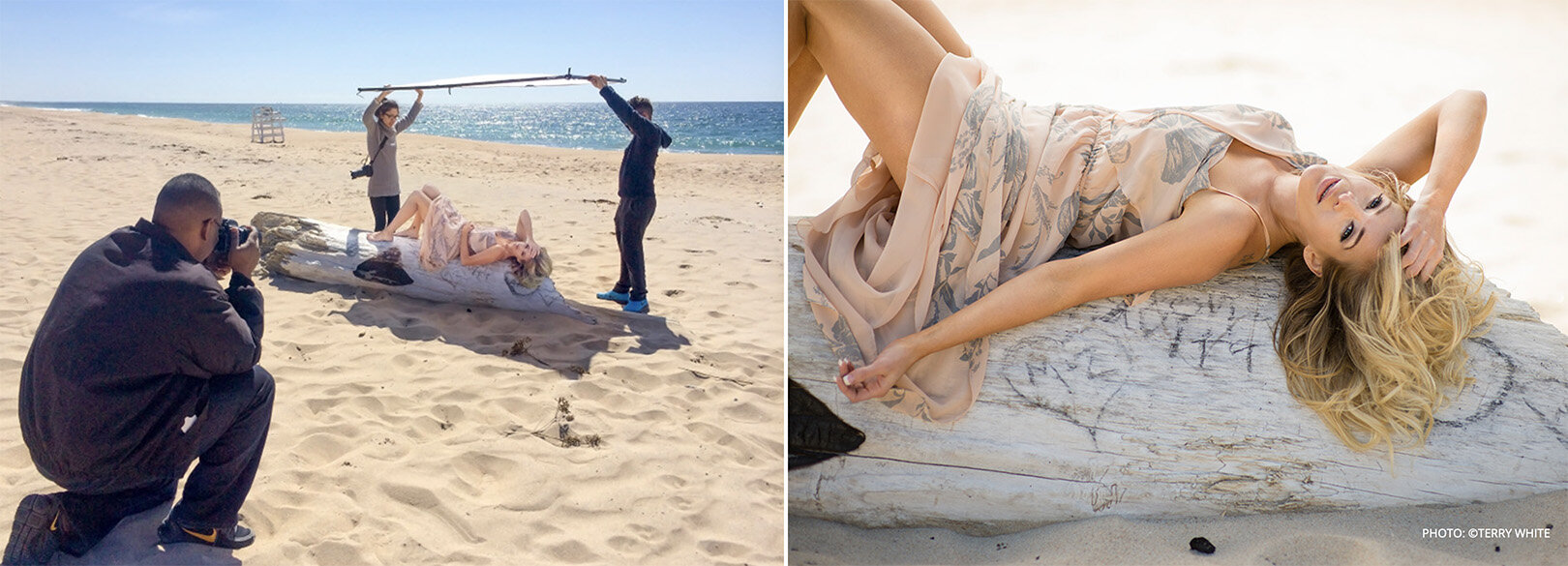
Here we have a scrim in action in sunlight. You can see how soft the otherwise incredibly hard sunlight has now become. Image from the Westcott website, photo taken by Terry White
What will I use as my scrim?
Remember, we’re actually more concerned with making the frame for our scrim in this article. The scrim is actually the fabric that goes on the frame and you can practically use any white fabric you want as a scrim. Sure, you need to be mindful that the fabric is white and slightly translucent, but I’ve used bedsheets and even old curtains on locations as makeshift scrims in the past.
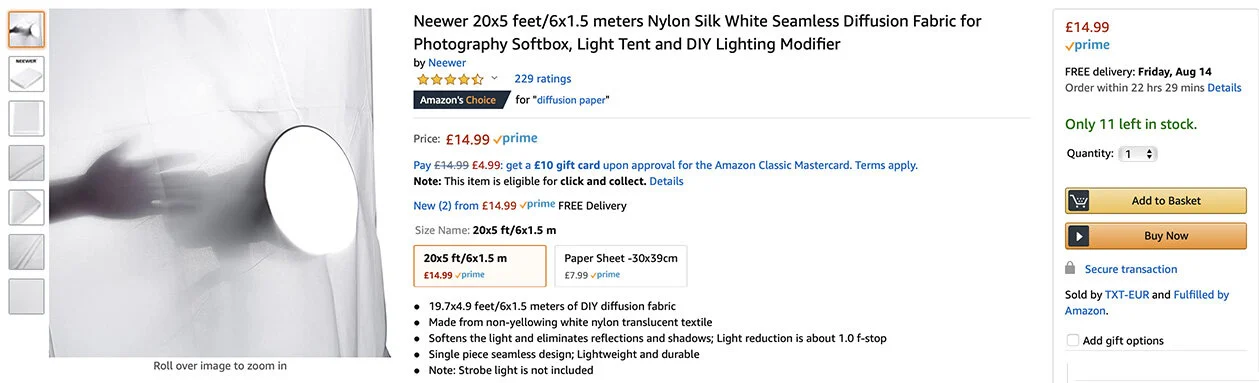
For this article, I bought some professional diffusion fabric and it’s actually far cheaper than you might expect. Here’s what I purchased below…
Use whatever fabric you like, but just be mindful of the size you purchase in relation to the frame you’re making.
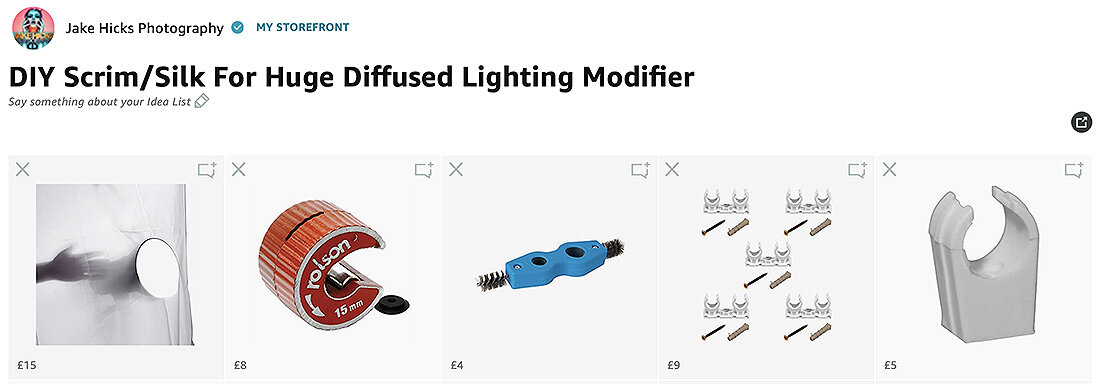
Here is an Amazon affiliate link to everything I purchased for this frame and the diffusion material is included in there too.
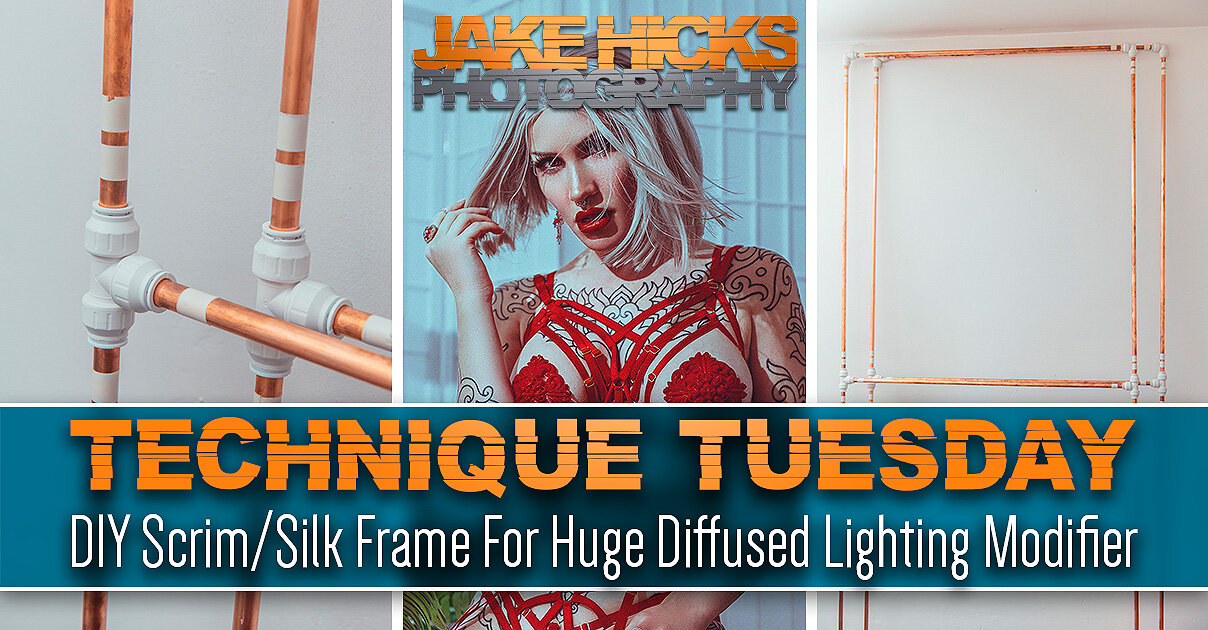
Kit List for DIY Scrim/Silk For Huge Diffused Lighting Modifier

Yes this is an affiliate link and I will get a few grains of sand if you use it. Trust me the affiliate link is just an easy way for me to put everything together and share a single link for you. If you find any of these items elsewhere that are cheaper or better, then by all means buy them there. If you love what I do and still want to offer up a small thank you, I’d far rather you donate a small amount to me directly and get yourself a hi-res printable version of one of my books here: Studio Lighting Books
Don’t do this… The first frame was plastic. It didn’t end well.
Mistakes were made…
It’s worth bearing in mind that there’s already scores of film students who’ve made their own scrim frames. Sadly, I didn’t look at those examples and I made all my own mistakes which hopefully means you won’t have to.
Don’t believe I made mistakes? Take a look at the image included here…
I’ve already made this damn article twice as the first time I made the frame I was dumb enough to make it out of plastic pipe!!!
….it didn’t go well and the damn thing fell apart almost instantly!!!
So yeah, don’t do that. But what should you make your frame out of? In the end, I decided to make my frame from 15mm copper piping. Yes you can make it from other piping and sizes, but I wanted to use quick release connectors so I could easily assemble and reassemble my frame multiple times. More on those connects later, but that’s ultimately why I went with the 15mm copper pipe.

In the unlikely even that you can’t read Cornish, I’ve also provided the measurements in English for this frame elsewhere in the article too.
How big shall I make it?
This question is highly dependant on a couple of things. Firstly, how big is the space you’re planning on using it in? And how many of these panels do you want to make?
I only ended up making this scrim modifier as I was bored being stuck indoors during the great apocalypse of 2020. As a result, I made mine with the limits of my home ceiling in mind and I recommend you do the same. Secondly, I wanted to make two panels or frames, so that they could be connected together and then stand unaided like an open book would do.
Here are the measurements I used…
Each frame panel requires:
3x 150cm sections
4 x 100cm sections
Multiply that by 2 for both panels and I need 17 metres of copper pipe.

Copper pipe is pretty easy to purchase and you can pick it up from many DIY stores…. although they tend to be a lot more expensive than buying it from specialists like plumbers. 18m of copper pipe cost me less than £40.

John Guest Speedfit connectors allow you to assemble and disassemble your frame with ease if needed.
How shall I hold all the pipes together?
Do you remember me mentioning that I screwed up and bought all this in plastic pipe first? Well as a result of that wasted order, I did actually purchase a whole bunch of plastic connectors. I bought these specific connectors as they are designed to be easy to use and simply connect the pipes to them via screwing them up by hand and you’re done. I liked this option as it also means I could unscrew them and disassemble my frame and reassemble it as often I liked.
These plastic connectors are called John Guest Speedfit connectors and are definitely worth a look if you’re after a simple way to connect it all together.
You can find more info on the John Guest Speedfit connectors here: https://www.johnguest.com/speedfit/
How many connectors will I need?
For my frames I decided to brace the longer side sections with a central piece too (I highly recommend doing the same). As a result I not only needed 4x corner sections, but 2x T-joint connectors too. Here’s the outline…

I actually only needed 8 corners, but it was cheaper to buy a pack of 10 above.
Do I need anything else?
There are a couple of extra things you can pick up to complete the design and they will make your life easier too.
Click to enlarge
Copper pipe cutter
There is a bunch of ways to cut copper pipe and you could even use a hacksaw. But I will say that this little tool is ingenious, incredibly quick and easy to use, but more importantly, it actually leaves the ends of your pipes curled in slightly. This not only makes it safer with no sharp edges, but the pipes are now far easier to use with the Speedfit connectors. I highly recommend you use this cutter or one similar.
Click to enlarge
Deburrer
This one is up to you, but they cost next to nothing so I recommend getting it. All it does is sand down the edges of your pipe where you cut it via metal bristles. You are cutting metal after all so any stray edges and splinters of metal will hurt if you catch yourself on them. Simply use this tool (that is specific to the size pipe you have) on every cut section you make and you’re done.
Click to enlarge
Frame Connectors
Granted, frame connectors isn’t the name of these, but it’s what I use them for. Clip these to one edge of one frame and then clip the other side of this to the other frame and you now have yourself an open book style scrim that will stand on its own.
Frame Clips
Click to enlarge
These little individual 15mm clips are super cheap and it’s what we’ll be using to actually clip our diffusion fabric to our frame. Like I said, they’re really cheap so just buy a bunch of them to hold your diffusion fabric in place.
Assembly
Okay so we have all our parts, now it’s time to put it all together…
Once you have all your parts, you’re ready to start assembling. Tip: I used electrical tape on the ends of the two size poles to distinguish them. This just makes reassembly faster in the future when you’re holding similar length poles.
Measure and Cut
First things first, we want to lay out our pipes and measure them into the sections you need cutting.
Next you’ll simply need to cut them and if you’re using that cutting tool I recommended, a few twists around the pipe with it and you’re done.
Click to enlarge
Deburr and Sand
Next up we just want to take off any stray splinters or rough and sharp edges. Use that deburring tool on all the ends to ensure they’re free of rough edges. Then I just used the other end of that tool to clean up the ends on the outside too.
Lastly, and this is a purely cosmetic addition, but I just took a sheet of sandpaper and rubbed the whole pipe down to take the shine off. Like I said, this entirely optional and copper is very soft so it only takes a few seconds to rub each pipe down.
Click to enlarge
Connecting
With all our separate pipes cut and laid out, it’s now time to connect everything together.
Click to enlarge
If you’ve chosen the JG Speedfit connectors like I have, then here’s a few important things to remember when assembling and dissembling your frame with them.
Important: To insert the pipe into the connector, it needs to be fully unscrewed. You should notice that if this is the case then the collar at the base of the connector is snug against it. Once the pipe is inserted and the collar tightened, the collar should now be separated from the main connector housing.
The reason I mention this, is because when it comes to decouple these, sometimes the collar remains separated and the pipe will not come out. If that is the case, make sure you push that collar back into place if needed and the pipe can be removed with ease.
Click to enlarge
Tape
You are pretty much done, but there was one last thing that I did for convenience and that was to mark up the different pipe lengths with electrical tape. Two white strips for the side sections and one white strip for the horizontals. This just makes life that much easier when pulling 14 similar looking copper pipes out of a bag!
Click to enlarge
Are we done yet?
Yes we are finally all done and ready to shoot. Let’s take a quick look at the final frame constructed and with the diffusion in place.
Click to enlarge: Here we have the final form. My two scrim frames assembled and ready for the application of the diffusion material.
Click to enlarge: Here I’ve attached my diffusion material to one of the frames and in the far right image we can see me connecting the two frames together with a dual 15mm pipe connector.
What can I do with my scrim now?
So big congratulations are in order, you’ve finally finished your own DIY scrim frame. But what now? What can we use this jumbo diffusion panel for? Well this article is already big enough so I’ll leave it here this week, but next week I’ll share an article on how I shot the images below with my scrim….
Click any of the images below to enlarge them…
Featured model: Ryo Love
In the above shots you should be able to see some beautifully soft light as well as some harder light in there too. Next week I’ll explain how this was setup and shot because with such an incredibly soft light source thanks to this jumbo scrim, we can also seamlessly add hard light into the shot as well to create some very unique looks.
PLUS! This is actually shot in my living room! I made the DIY scrim during lockdown and I shot this before we reopened the studio, so you can even create unbelievably soft light like this in small spaces like a home studio too!
I’ll speak to you all again next week. Until then, stay safe.
For reference, here’s that link to all the products you need on Amazon:
Kit List for DIY Scrim/Silk For Huge Diffused Lighting Modifier
Thank You
Thanks for checking out this article and spending a little bit of your day with me here. I hope you found it useful and that you left here with a little more knowledge than when you arrived. If you did, then this was worth it. As always, if you have any questions or comments about the scrim, then by all means fire-away in the comments below and I’ll do my best to answer what I can. Thanks again and I’ll see you in the next one.
Don’t forget to sign up to my newsletter to be sent all of these photo tips and techniques articles every month in case you miss one.


Have you downloaded my FREE 50 page book yet?
I recently released a huge 50 page studio lighting book, absolutely free!
Book 1 - ‘Understanding Light’ is available now and it covers the fundamentals of reading the light in a studio. Follow the link below and download your copy now. This book is free to anybody who wants to check it out, but all donations to the project are certainly greatly appreciated.